


Glowing Girl Magazine
2023-2024
Glowing Girl Magazine is a youth publication created to empower and affirm Black girls ages 10–18 through authentic storytelling, representation, and community. Our goal was to make womanhood feel relatable, encouraging, and expansive — a place where young girls could see themselves reflected in real stories, real guidance, and real joy. Through features, tutorials, culture pieces, and conversations with inspiring women, Glowing Girl became a space for confidence, identity, and unapologetic growth.
Glowing Girl Magazine
2023-2024
Glowing Girl Magazine is a youth publication created to empower and affirm Black girls ages 10–18 through authentic storytelling, representation, and community. Our goal was to make womanhood feel relatable, encouraging, and expansive — a place where young girls could see themselves reflected in real stories, real guidance, and real joy. Through features, tutorials, culture pieces, and conversations with inspiring women, Glowing Girl became a space for confidence, identity, and unapologetic growth.



Bringing the Brand to Life
Here, the identity moved from concept to application as the visual system was tested across products, layouts, and real‑world materials.


I introduced strategic refinements—new motifs, adjusted color usage, and stronger typographic decisions—to mature and elevate the overall identity.
I refined spacing, hierarchy, and pacing across pages to strengthen cohesion and create a smoother, more intentional reading experience.
Elevating the Brand
Finding Consistency
Scroll Down


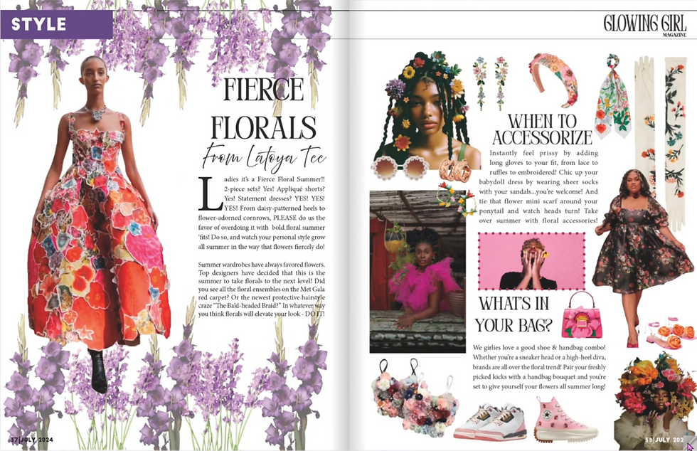
I designed the first issue as a full application of the system, shaping spreads that balanced structure, storytelling, and visual rhythm. Though the first edition was strong, it revealed clear opportunities to refine and expand the design system.
Inside the Pages: 1st Issue
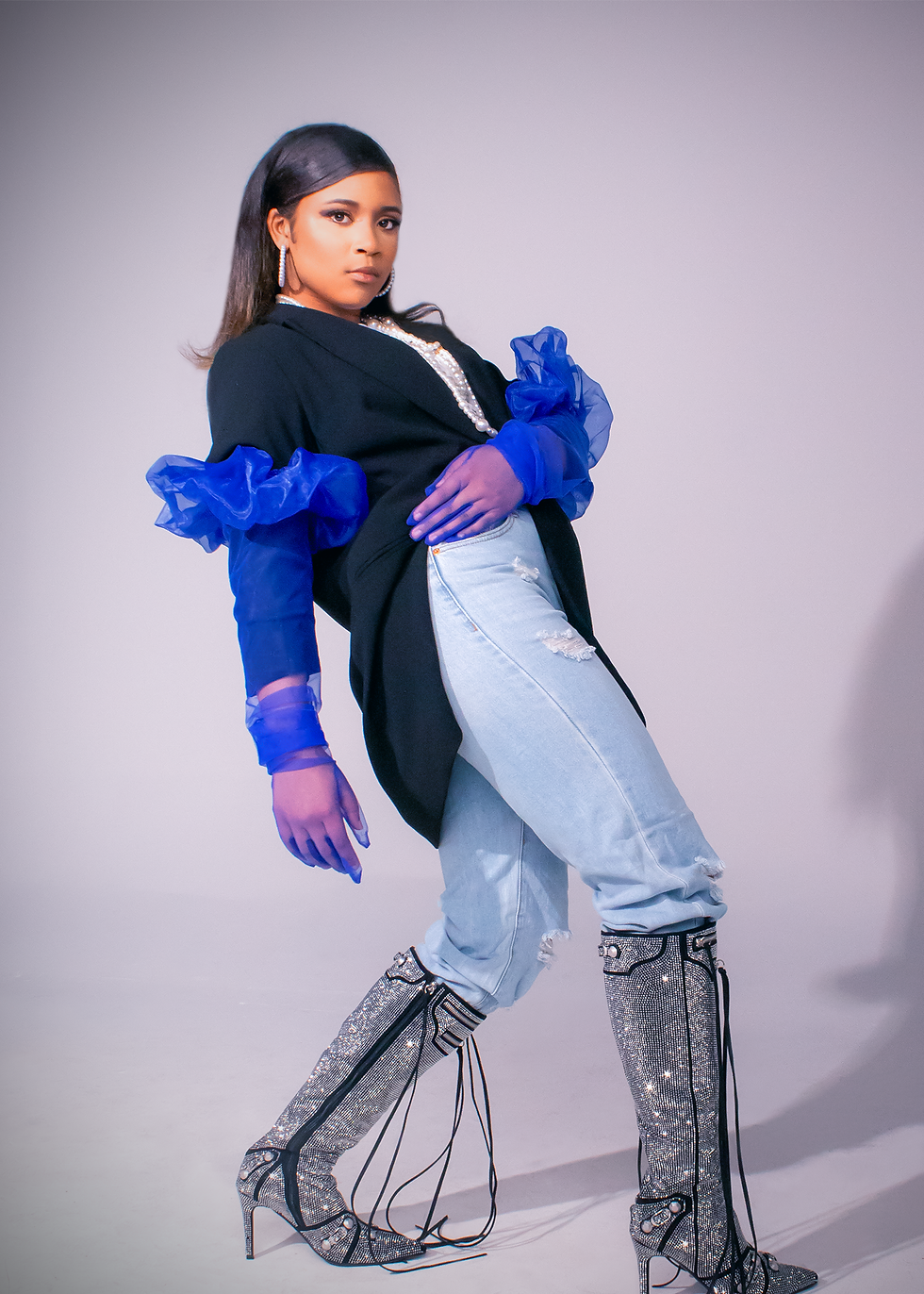
I curated and directed photography that aligned with the visual system, ensuring the imagery supported the layouts and reinforced the magazine’s tone.
The Photos that Told the Story
06
05

Design in Motion
07
08
The Final Expression
I leaned into expressive typography, confident color, and dynamic layouts to create a visual language that felt modern, memorable, and distinct.
Glowing Girl Experience
Final Remarks
Bold Design Choices
A real‑world activation tested the brand across product sales, a wellness workshop, and a community workout experience.
This final stage presents the complete, cohesive brand system, expressed across print, product, and event activation to show its full maturity.


12
11
10
09


I applied the identity across real‑world formats to validate its flexibility, coherence, and ability to adapt to different environments.

Brand in Context
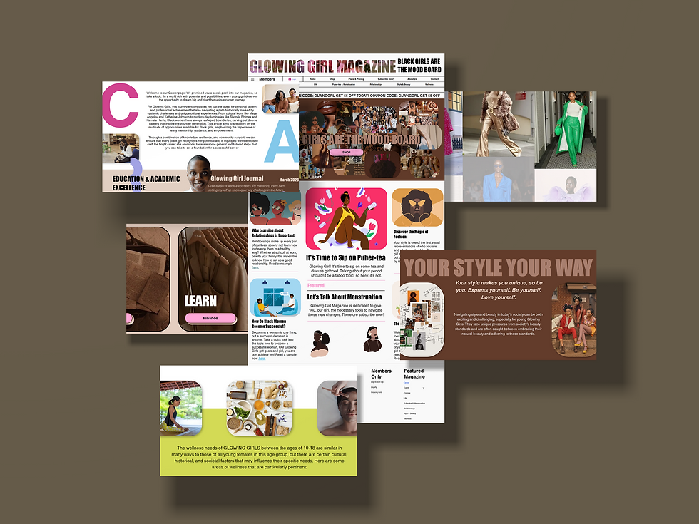
I extended the identity into social media, merchandise, and promotional materials to demonstrate how the system scales beyond the magazine.
Making the Brand Visible

Brand Fully Revealed


Scroll Down


I translated the system into production‑ready templates and assets, refining details and preparing files for seamless use across print and digital formats.
Production Execution
I translated the visual identity onto physical and digital products, ensuring the logo, color, and typography held their integrity across covers, apparel, merchandise, and supporting materials.
System Application
I defined the core identity system by establishing a cohesive palette, typographic hierarchy, and tonal direction that set the foundation for all future design decisions.
Identity Definition
02
01
03
I explored a wide range of logo concepts, testing different letterforms, weights, and compositions to find a mark that captured the magazine’s youthful energy and visual clarity.
Logo Exploration


This section captures the earliest explorations—those initial sketches, tests, and visual instincts that shaped the foundation of the brand..
The First Spark
04
Where the Design Ideas Begin
This section captures the earliest explorations—those initial sketches, tests, and visual instincts that shaped the foundation of the brand.
Where the Design Ideas Begin
The First Spark
I translated the system into production‑ready templates and assets, refining details and preparing files for seamless use across print and digital formats.
Production Execution
04
I translated the visual identity onto physical and digital products, ensuring the logo, color, and typography held their integrity across covers, apparel, merchandise, and supporting materials.
System Application
03

Scroll Down
I defined the core identity system by establishing a cohesive palette, typographic hierarchy, and tonal direction that set the foundation for all future design decisions.
I explored a wide range of logo concepts, testing different letterforms, weights, and compositions to find a mark that captured the magazine’s youthful energy and visual clarity.
Identity Definition
02
01
Logo Exploration
Bringing the Brand to Life
Here, the identity moved from concept to application as the visual system was tested across products, layouts, and real‑world materials.
Design in Motion
07
I introduced strategic refinements; new motifs, adjusted color usage, and stronger typographic decisions, to mature and elevate the overall identity.
Elevating the Brand
Scroll Down

I curated and directed photography that aligned with the visual system, ensuring the imagery supported the layouts and reinforced the magazine’s tone.
The Photos that Told the Story
08
I refined spacing, hierarchy, and pacing across pages to strengthen cohesion and create a smoother, more intentional reading experience.
Finding Consistency
I designed the first issue as a full application of the system, shaping spreads that balanced structure, storytelling, and visual rhythm. Though the first edition was strong, it revealed clear opportunities to refine and expand the design system.
Inside the Pages: 1st Issue
05
06
Closing Statement
I loved this project because it began as a tiny spark and grew into something far bigger than any of us imagined. Watching a baby idea mature into a full, functioning brand reminded me why I’m drawn to branding in the first place—building something that knows how to take up space. The deadlines were intense and the work was demanding, but seeing the girls’ stories come alive on the page made every moment worth it. This project shaped my design voice, clarified my integrity, stretched my capacity, and gave me the confidence to step fully into my role as a designer and director. Every creative has a project that marks their growth; this one marked mine.
"
One of Asha's most remarkable attributes is her ability to deliver exceptional work while adhering to deadlines... Her innovative ideas and fresh prespectives have breathed new life into our projects, garnering praise from both clients and colleagues alike.
Jasmine Willis
CEO and Editor in Chief
This final stage presents the complete, cohesive brand system, expressed across print, product, and event activation to show its full maturity.
Brand Fully Revealed
The Final Expression

I applied the identity across real‑world formats to validate its flexibility, coherence, and ability to adapt to different environments.
Brand in Context
Glowing Girl Experience
A real‑world activation tested the brand across product sales, a wellness workshop, and a community workout experience.

11
12
Final Remarks

I leaned into expressive typography, confident color, and dynamic layouts to create a visual language that felt modern, memorable, and distinct.
Bold Design Choices
09
I extended the identity into social media, merchandise, and promotional materials to demonstrate how the system scales beyond the magazine.
Making the Brand Visible

10
I loved this project because it began as a tiny spark and grew into something far bigger than any of us imagined. Watching a baby idea mature into a full, functioning brand reminded me why I’m drawn to branding in the first place—building something that knows how to take up space. The deadlines were intense and the work was demanding, but seeing the girls’ stories come alive on the page made every moment worth it. This project shaped my design voice, clarified my integrity, stretched my capacity, and gave me the confidence to step fully into my role as a designer and director. Every creative has a project that marks their growth; this one marked mine.
Closing Statement
"
One of Asha's most remarkable attributes is her ability to deliver exceptional work while adhering to deadlines... Her innovative ideas and fresh prespectives have breathed new life into our projects, garnering praise from both clients and colleagues alike.
Jasmine Willis
CEO and Editor in Chief