


The Social
Narritives
2023-2024
Social media design plays a critical role in shaping how brands communicate every day, requiring systems that are clear, adaptable, and visually consistent across fast‑moving platforms. The projects in this section highlight the range of social needs, from lifestyle‑driven storytelling to structured educational content to hybrid editorial formats, and demonstrate how visual identity can flex while remaining grounded in strategy. Together, they show how thoughtful systems, curated grids, and audience‑specific design choices create social experiences that feel cohesive, intentional, and aligned with each brand’s goals.
2023-2024
Social media design plays a critical role in shaping how brands communicate every day, requiring systems that are clear, adaptable, and visually consistent across fast‑moving platforms. The projects in this section highlight the range of social needs, from lifestyle‑driven storytelling to structured educational content to hybrid editorial formats, and demonstrate how visual identity can flex while remaining grounded in strategy. Together, they show how thoughtful systems, curated grids, and audience‑specific design choices create social experiences that feel cohesive, intentional, and aligned with each brand’s goals.
The Social Narritives



Final Remarks
Social posts showcased events, community partnerships, and program impact, helping demonstrate BPUE’s value and invite community members to get involved through voting.
Implementing Engangment


Content highlighted the program’s academic tools and learning resources, using clear, student‑centered messaging to communicate how BPUE strengthens educational outcomes.
Showcasing Support
This campaign showcased BPUE’s student‑focused academic support through clear, impact‑driven social content that highlighted learning tools and community partnerships, contributing to their public recognition as a Yass Prize Semi‑Finalist and STOP Award recipient.
2023 Yass Prize Semi-Finalist Awardee
BPUE Campaign


03

Scroll Down
I explored mood and tone through soft, product‑forward visuals that introduced the brand’s sensory world and established its emotional narrative.
Experimenting with Texture


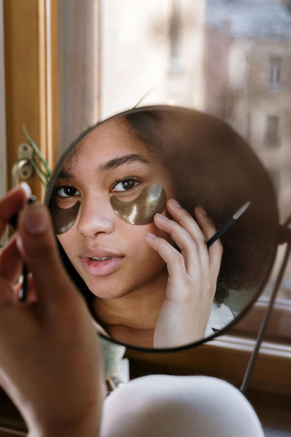
I refined the visual system through color, type, and layout, creating a clean, modern structure that clarified the brand’s voice and strengthened its digital presence.
Defining Brand Clarity

I applied the identity to everyday content, product posts, tutorials, and social moments; to show how the brand functions in real use and maintains consistency across platforms.
Celebrating Routine
02
This project redefined Silk’s digital presence through soft, product‑forward visuals and a modern system that communicated clarity, care, and brand confidence.
Test Brand Identity Social Media
Silk Cosmetics
Scroll Down
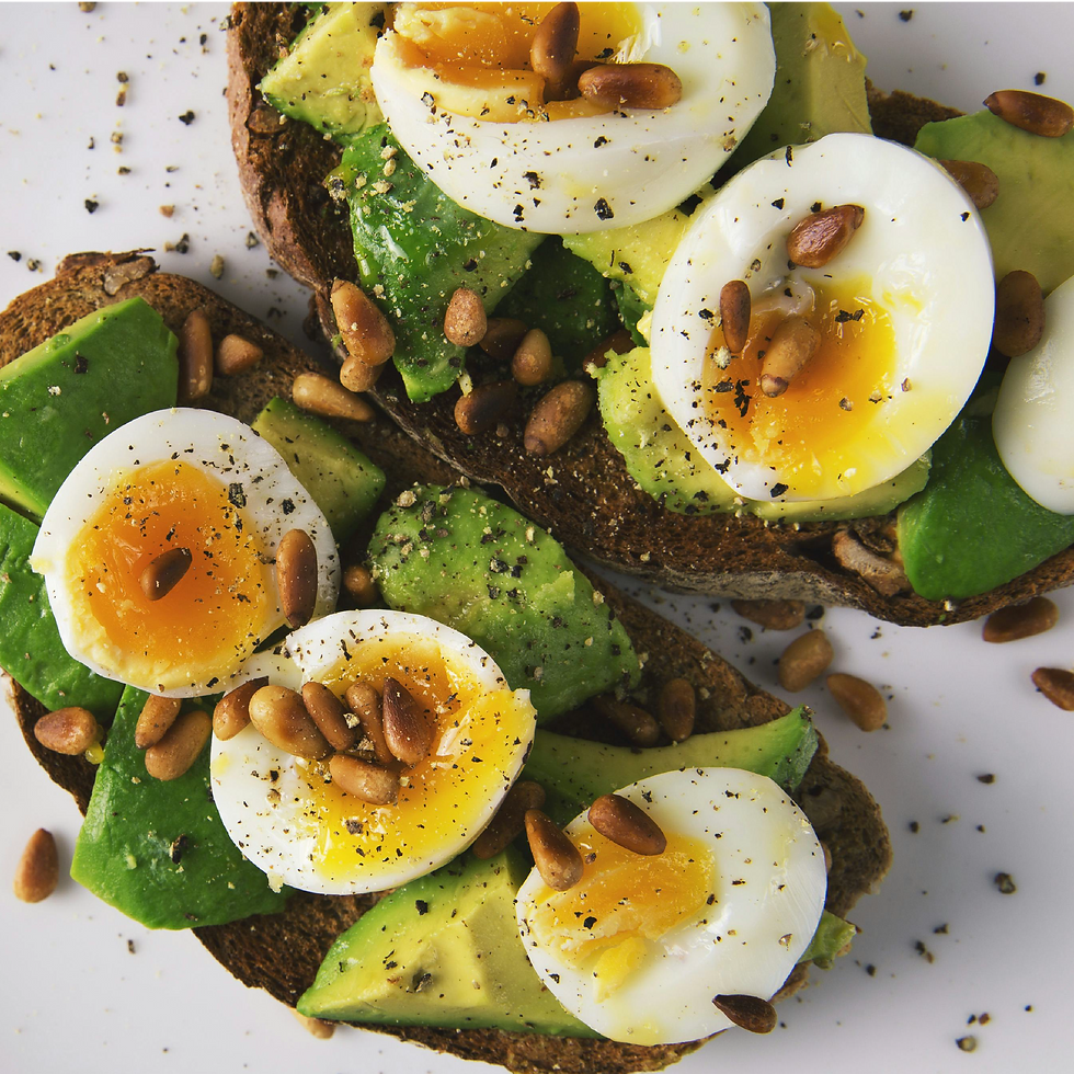
The system was applied to real content, demonstrating how recipes, reels, and blog graphics worked together as a cohesive, scroll‑ready digital experience.
Serving the Experience
I refined the visual rules—color, type, and layout—to build a flexible structure that supported both storytelling and clarity across every post and motion asset.

Plating the System
I explored how Food52’s editorial voice could translate into social, testing tone, pacing, and visual hierarchy to establish the foundation of the content system.
Prepping the Story
01
This test campaign translated Food52’s editorial warmth into social content, using layout and motion to create posts that felt fresh, approachable, and visually cohesive.
Test Social Presentation Project
Food52 Blog


This test campaign translated Food52’s editorial warmth into social content, using layout and motion to create posts that felt fresh, approachable, and visually cohesive.
Test Social Presentation Project
Food52 Blog
The system was applied to real content, demonstrating how recipes, reels, and blog graphics worked together as a cohesive, scroll‑ready digital experience.
Serving the Experience
I explored how Food52’s editorial voice could translate into social, testing tone, pacing, and visual hierarchy to establish the foundation of the content system.
Prepping the Story
Plating the System
I refined the visual rules—color, type, and layout—to build a flexible structure that supported both storytelling and clarity across every post and motion asset.
Scroll Down
01
This project redefined Silk’s digital presence through soft, product‑forward visuals and a modern system that communicated clarity, care, and brand confidence.
Test Brand Identity Social Media
Silk Cosmetics
Scroll Down
I refined the visual system through color, type, and layout, creating a clean, modern structure that clarified the brand’s voice and strengthened its digital presence.
Defining Brand Clarity
02
I applied the identity to everyday content, product posts, tutorials, and social moments; to show how the brand functions in real use and maintains consistency across platforms.
Celebrating Routine

Using Texture to Connect
I explored mood and tone through soft, product‑forward visuals that introduced the brand’s sensory world and established its emotional narrative.
This campaign showcased BPUE’s student‑focused academic support through clear, impact‑driven social content that highlighted learning tools and community partnerships, contributing to their public recognition as a Yass Prize Semi‑Finalist and STOP Award recipient.
2023 Yass Prize Semi-Finalist Awardee
BPUE Campaign
Social posts showcased events, community partnerships, and program impact, helping demonstrate BPUE’s value and invite community members to get involved through voting.
Final Remarks
Implementing Engangment
Content highlighted the program’s academic tools and learning resources, using clear, student‑centered messaging to communicate how BPUE strengthens educational outcomes.


Showcasing Support
03
Closing Statement
I love working on social media projects because the constraints are lighter than print, giving me room to explore, iterate, and curate in a more fluid way. The grid becomes a playground, an opportunity to build variety, then arrange it with intention so the work feels personal and alive. Each campaign demanded a different visual approach: one warm and lifestyle‑driven, another structured and educational, and the blog sitting somewhere in between. Moving across these modes grew me as a designer, reinforcing the balance I value most; structured, sound design paired with personality, warmth, and real‑world clarity.
"
Make it simple.
Make it Memorable.
Make it inviting to look at.
Make it fun to read.
Leo Burnett
American Advertising Executive
I love working on social media projects because the constraints are lighter than print, giving me room to explore, iterate, and curate in a more fluid way. The grid becomes a playground, an opportunity to build variety, then arrange it with intention so the work feels personal and alive. Each campaign demanded a different visual approach: one warm and lifestyle‑driven, another structured and educational, and the blog sitting somewhere in between. Moving across these modes grew me as a designer, reinforcing the balance I value most; structured, sound design paired with personality, warmth, and real‑world clarity.
Closing Statement
American Advertising Executive
Leo Burnett
Make it simple.
Make it Memorable.
Make it inviting to look at.
Make it fun to read.